“
The beauty of this world is placed in the vivid yet complex colors of
nature
”
This September, I got the chance to learn something new. As some of you
might know, I worked for a shoe company since July and it produces shoes for a certain brand, which I have to deal with
the brand’s standard colors. There is a specific job description for this
job and we call it FMCA (Footwear Material Color Approval). The main job is
to check the material color against the standard. Sounds simple but, it
wasn’t. Everyone has a different ability to see color and color can look
different in different lightings.
According to Merriam-Webster, color is “a phenomenon of light (such as red,
brown, pink, or gray) or visual perception that enables one to
differentiate otherwise identical objects”. I recall my physics class where
we are talking about how colors formed. Not a good student of physics, but
this topic is the most memorable one. I remembered that I had an experiment
using a flashlight and mirror, there we can see a rainbow. You know the
colors in a rainbow, red, orange, yellow, green, blue, indigo and violet
are the basic colors. From those colors, we could have a thousand
possibilities of other colors, like pastel tone, earth-tone color, etc.
Since I was a kid, I always like seeing Pantone swatches for wall paintings
or swatches of nail polish in the salon. This time, I got to have an access
to textiles swatches, we called it scotdic. Finally, I found
something I like about my job (but it's also quite annoying).
Ever heard about RGB or CYMK? Primary color and secondary color? RGB is the
most basic color usually used widely in the design world, which is Red, Green,
and Blue (if you watched ‘Start Up’, you probably know about it since Nam
Dosan is obsessed with RGB colors). CYMK is the colors you can see in your
printer inks, such as Cyan, Yellow, Magenta, and Black. Primary colors are
red, yellow, and blue. The secondary color is orange, green, and purple. After
the secondary color, you will have a tertiary color. All of these colors can
be seen in the color wheels. I believe you have seen a color wheel before,
right? Yeah, the one you can find in photo editing applications. Many are
quite familiar with color wheels nowadays and it is very interesting to
play with the colors.
 |
RGB (taken from drama "Start-Up"
Credits: Google Images |

Actually, color creation is a very interesting topic. Color creation
means mixing the basic colors into secondary colors or other colors. For
example, if you mix red, yellow, blue, and green with the correct ratio, you
will get a violet color. Even to get a black color, you have to mix the
right amount of color to have a pure black color. Now, if you look around
your closet, you might find your black clothes might have some different
hues. Some of them might be a greenish-black, or reddish black, or bluish-black. A greenish-black means the ratio of green color is more than the
rest of the color. It’s hard to notice it, but it’s fun.
Speaking of colors, I’m always amazed by how people create names for every
color such as the green army, cream, khaki, olive, coral, pink, etc. My favorite
color is a baby pink. How about you? But lately, I started to favor dark
olive, army green kind of palette. Especially for clothes, I think I have
like 5 clothes in those colors in my closet. I think I look good in that tone. I think last year taking a personal color test was quite trending.
Every person has a different color tone and you can find out yours by
taking a test. There are some websites that provide free tests. I took one
from here. I got a deep winter – autumn color palette. For more info about it, you can read
it here. You can check out yours and share it with me. I really wanted to try out
the test from a professional personal color advisor like Lee Hyeri
(Girl’s Day member/Korean actress) ever done before. You can check out her
experience here.
 |
| Me dressing in shades of dark olives. |
Colors are important and beautiful. But, lately, we hear a lot about skin
color discrimination. I don’t know why people make a big deal about color
difference. We are special in our own way, including what skin color we
have. I’m really sad about the fact that people are discriminating against others because their skin color is different from theirs. The skin color
discrimination issue has raised since a century ago and it’s getting worse. I
mean, come on, we are more civilized and educated. By this time, we should
clearly learn and understood that everyone is the same despite their skin
color, race, and gender. On my Twitter timeline, there are lots of tweets
about this particle issue in the USA. Remember when the #BLACKLIVESMATTERS hashtag was trending all over the media last year? I think it's time to speak out our voices about this issue. No more tolerating discrimination, especially when it comes to taking someone's life. Varieties of skin color make the world
more beautiful. Look at the Disney princesses. Disney creates princesses from all kind of culture with different skin tones. Imagine if there is no color to our skin? All of us might
look terrible and scary. This kind of issue should have been resolved. I
really wish everyone know that skin tone is not defining who you are, your
character and attitude do.
 |
Disney Princess from different cultures and skin color, but still beautiful.
Credit: Google Images |
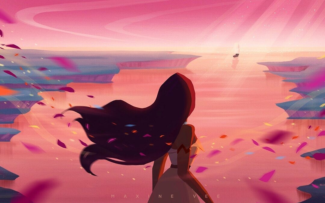
Talking about it, the movie ‘Pocahontas’ and its’ theme song, ‘Colors of
the Wind’ came across to my mind. ‘Pocahontas’ movie was released in 1995,
which is 26 years ago. Even though two decades have passed by, the old
same issue is still hanging around in our lives. Despite the underlying
storyline about the tribe versus the settlers, this movie delivers an
important message. We tend to forget that God gave us beautiful earth
so we can live comfortably. We tend to take things for granted. Burning
down the forest to get more land to expand, dumping the waste not to the
proper place, wasting energy and water, and many more things that resulted
in destroying the beautiful mother earth. There is a reason why God provides
us the place to stay first before He creates humans. But this sinful human
being is not being grateful and like to exploit things. They often forget
and overlook their surroundings.
 |
Scene from 'Pocahontas', Disney (1995)
Credit: Google Images |
I looked up the lyrics of ‘Colors of the Wind’ after hearing the song few
days ago. While looking at the lyrics, I also searched for the messages
behind the song and came across this post. As I get older, I tend to focus
on the lyrics of the song I listened to.
“For whether we are white or copper skinned
We need to sing with all the voices of the mountains
We need to paint with all the colors of the wind
”
The song clearly and brutally honest about the color differences. No matter
what skin color we have, we are the same and no human power can overcome
the power of mother nature. So why bother to fight it, while all you need to do is enjoy the beauty of it. The wind is invisible, but clearly, without the
wind, there would be no color in our life. But no matter how smart and powerful
humans can be, we surely cannot paint with the wind. It is beyond of our
ability. Only God can because He is the Creator. (Well, actually I haven’t really watched ‘Pocahontas’ (poor me, I know),
but I really enjoyed the soundtrack, which made me want to watch the full
movie again.)
 |
| Credit: as tagged (via Google Images) |
After months of playing with color, I came to think what if there are no
colors in this world? I couldn’t imagine if I’m a color blind too. It’s so
good and fun to play with colors and couldn’t see it or differentiate it
would be terribly sad. Can you imagine, what if God didn't create color for
this world? For me, the beauty of this world is placed in the vivid yet
complex colors of the nature. I like the orange, yellow, and green leaves
when it’s autumn. Also, how calming it is to shades of blue sea when you
need to clear your mind. Imagine if those natures don’t have any colors to
it. It would be a suck life, I guess.
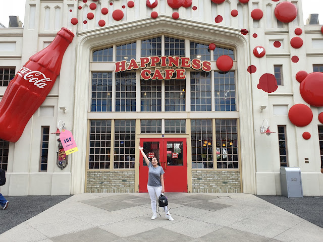
As the pandemic got worsen every day, I became to appreciate every photo
in my phone gallery for the memories captured. The time I got to see the
beach, waterfalls, skyscrapers, and even I’m grateful for the blue sky or
pretty cotton candy evening sky around the neighborhood. Not to forget the delicious food we eat every day is way much more delicious when it has pretty colors. Couldn’t get
enough chance to travel this year and experiences to be in nature, but
still appreciate every little thing in this world. Sharing some of my archives that has pretty colors #nofilterneeded
 |
| Somewhere in Bali, 2019 |
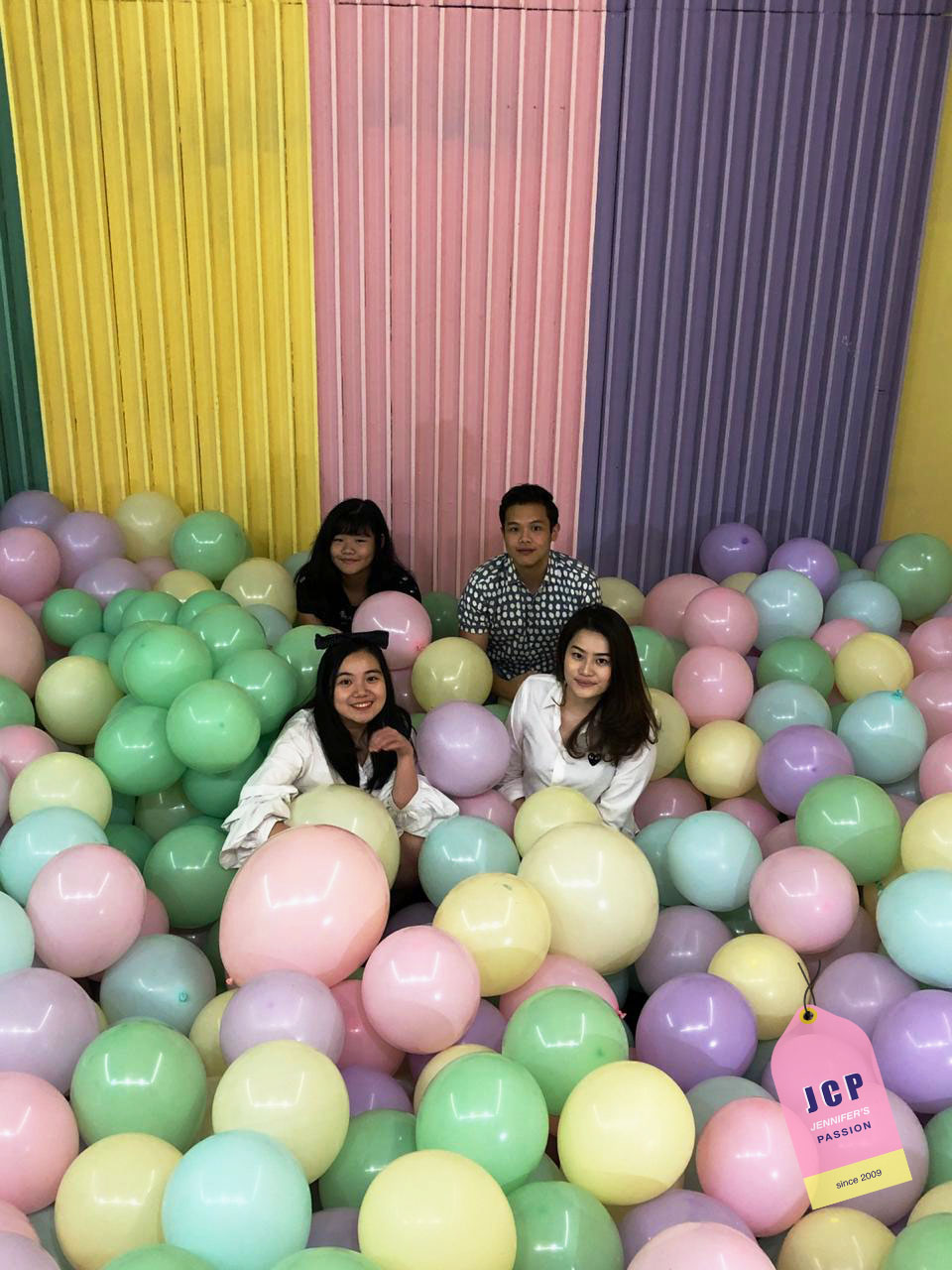
 |
| Colors = Baloons |
 |
Natural Shades of a Mountain
Mt. Gede, 2018 |
 |
| The Best Point of Seoul |
 |
| Merry Go Round Lights |
 |
| At the most colorful place on earth, Universal Studios Japan |
Thank you, God, for creating colors and I’m grateful that my eyes are totally
good for capturing the beauty of colors.
Actually, I was quite hesitant to write about this
topic but turns out it was pretty okay. I got to learn much more stuff rather than the things I learn from work. I know it’s been all over the
place and I missed my timeline again, but I tried my best and will keep on
posting the rest of the JCP Features ASAP. Have a colorful day and stay
safe everyone!
xoxo,
Jennifer
Further Readings:
https://www.popsugar.com/smart-living/biggest-color-trends-2021-48109389